The New Amazon Headquarters Is Butt-Ugly. That’s Because It’s Not for Us.
Most new architecture, like Amazon’s proposed new HQ, is hideous. That’s because it is made for corporations. Despite all the mistakes and brutalities of the Soviet experiment, at least their architecture was designed to serve the people instead.

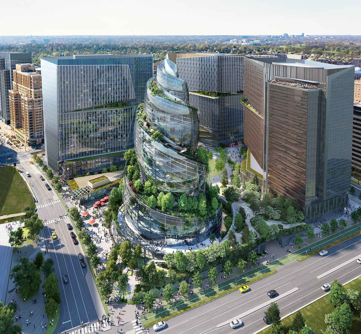
The Amazon building is a monstrosity. (NBBJ / Amazon)
I went to architecture school and write about architecture, so whenever a new building goes up somewhere, people ask me what I think about it. They ask not because they want to know my expert opinion and compare it to theirs, but because they understand that they are “supposed” to like whatever new thing has just gone up in their city, but they don’t, and they want me to explain to them what they’re missing.
Most of the time, I fail at this task. Most architecture that garners significant press is pretty banal. And it makes me sad that people feel they have to ask what they’re supposed to like about a building. We spend our whole lives in architecture. Even though they might not have studied it, most people have a sense of what they like and what they don’t when it comes to buildings. So if a new building isn’t speaking to people, if it makes people scratch their heads and go “huh?” in an unproductive way, then who is that building for?
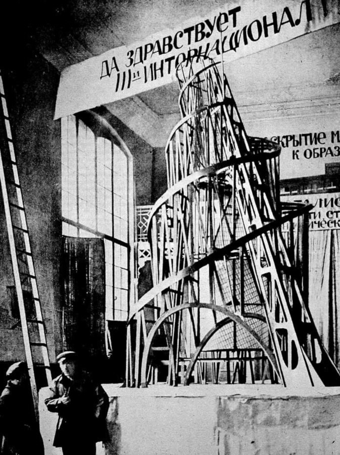
Amazon recently unveiled a design for its new headquarters in Arlington, Virginia. Designed by multinational architecture firm NBBJ, the building is a spiral glass tower placed within a city block, with trees on top. People have compared it to the poop emoji and, hilariously, Tatlin’s Tower, the monument to the Communist Third International designed by artist and designer Vladimir Tatlin.

In my estimation, the Amazon building is a monstrosity. Of course, we’ve only seen an image of it, but the way the image is rendered — bird’s-eye view, from where a drone might see the building, as opposed to from where a person might walk up to it — reveals a disregard for how an actual human being might experience it. We have very few clues as to what its scale might be — the giant glass panels, the completely arbitrary swirly shape that doesn’t even attempt to echo its neighboring buildings — all make it impossible to tell what the scale of this building is compared to a person. Despite its attempts to tie into nature by putting trees all around it and even on its roof surfaces, this building is decidedly antihuman.
But what the building looks like matters less than the role it plays for Amazon as a company and for Arlington as a city. In its current state — not a constructed building but a series of images of a building that will exist in the future — its role is to attract attention to Amazon, specifically to paint it as a leader in “green” capitalism, and investment in Arlington. Its role is also to continue to build an idea of what “progress” should look like.
Because it’s so capital-intensive, requiring so much money and labor, major architectural projects almost always end up expressing the goals of those in power. Under capitalism, one of those goals is touting private enterprise as the source of cutting-edge ideas and societal progress. Buildings become billboards for corporations — think of Facebook’s campus designed by Frank Gehry or Apple Park designed by Norman Foster.
Of course, architecture has also played the role of “billboard” in noncapitalist societies, too. When the object being advertised has more humane social values, the architecture tends to take more humane friendly forms.
In Soviet Modernism, Brutalism, Post-modernism: Buildings and Structures in Ukraine, we get a glimpse at such forms. Its authors, Alex Bykov and Ievgeniia Gubkina, show how architecture in Soviet Ukraine evolved from 1955 to 1991, tracing the evolution of Ukraine’s politics alongside the evolution of the physical shape of its buildings.
The book is an impressive tome of more than two hundred pages of glossy, beautiful images of architecture. A short introduction provides an overview of the country’s architectural history. In the postwar moment of the 1950s and ’60s, Soviet Ukraine joined Europe in using modernist architecture (think simple steel structures, clean lines, and lots of grids) as a symbol of a new era of technological progress.
Later, in the ’70s, a more conservative Ukrainian government used concrete-dominant, blocky brutalism — elsewhere the architecture of social housing and public projects like libraries — to project an image more progressive than that government’s policies. Later still, in the 1980s and ’90s, as the USSR opened itself up to global capitalism, Ukraine used postmodern designs in state projects, while postmodernism almost everywhere else in the world was used exclusively by corporations (think of those McDonald’s with the pastel interiors). Just like the Amazon headquarters attempts to appeal to investors through its image of “eco-friendly” capitalism, the buildings in Soviet Modernism also represent the values of its commissioners (in this case, the Ukrainian state), which evolved over time from a professed socialist politics to a more conservative statism, to finally a flirting with capitalism before the collapse of the USSR brought with it economic collapse and a fragmented nationalism.
The book shows these distinct periods in Ukrainian history, revealing the extent of the architectural variety produced in Soviet Ukraine: concrete disks and swooping staircases; soaring structures; wood, bricks of all colors and sizes; buildings with murals on them; and interiors with huge chandeliers and beautiful arches. All of this variety gently but firmly pushes back against the idea that all Soviet buildings were the same gray concrete blocks — an idea which has maintained its hold in the popular imagination, as evidenced by the dozens of messages I get any time I write about Soviet architecture, even as brutalism has enjoyed a revival in popularity.
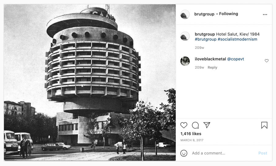
Offensive to people with more “traditional” aesthetic tastes — like Donald Trump, for example, who a few months before leaving office issued an executive order that all federal buildings should be built only in a “classical” style — brutalism’s form, as the book lightly suggests, is a direct result of its progressive aims. Yes, brutalism’s concrete heaviness can be intimidating, but as Instagram accounts like @brutgroup have demonstrated, this intimidation is often awe-inspiring. Brutalism also invariably features elements that are humanly scaled: cozy ceilings, wooden handrails, textured walls.

Its revival speaks to the appeal of this type of architecture, designed to elicit a reaction from its users, not just from potential investors. Though much of brutalism might’ve been propaganda for an authoritarian socialism, good propaganda still has to appeal to its mass audience — in this case, working people.
Joe Biden recently announced he would overturn Trump’s executive order to use only the classical style for federal architecture buildings. It’s a cheap shot in the culture war, but I’ll take it. Trump’s order was dumb. But executive orders dictating an architectural style are much less powerful than corporations’ dollars.
Building a building requires a lot of money. The people who have that money want to spend it in ways that will make them even more money. So they make buildings, like the Amazon headquarters, that serve as flashy billboards for other capitalists: to convince them to invest, to prove their savvy, to nab some headlines. These buildings, in turn, set larger architectural trends. Corporations — like Amazon, with its poop emoji HQ or Apple, with its campus that looks like a giant home button; or developers like Magellan in Chicago, responsible for the newly renamed St. Regis tower, which will be the third-tallest building in the city once it’s complete — make the rules about what architecture looks like and are the primary audience for that architecture’s design.
Even though it saddens me that people feel like they have to ask me what to like about buildings, it isn’t surprising they can’t find much to like. These buildings aren’t really made for them. For all of the missteps and brutalities of the Soviet experiment, a look at the architecture of a country like Ukraine under the Soviet Union opens a window into what architecture could look like if it was made for people instead of capitalists.