McMansion, USA
A McMansion is like obscenity: you know it when you see it.

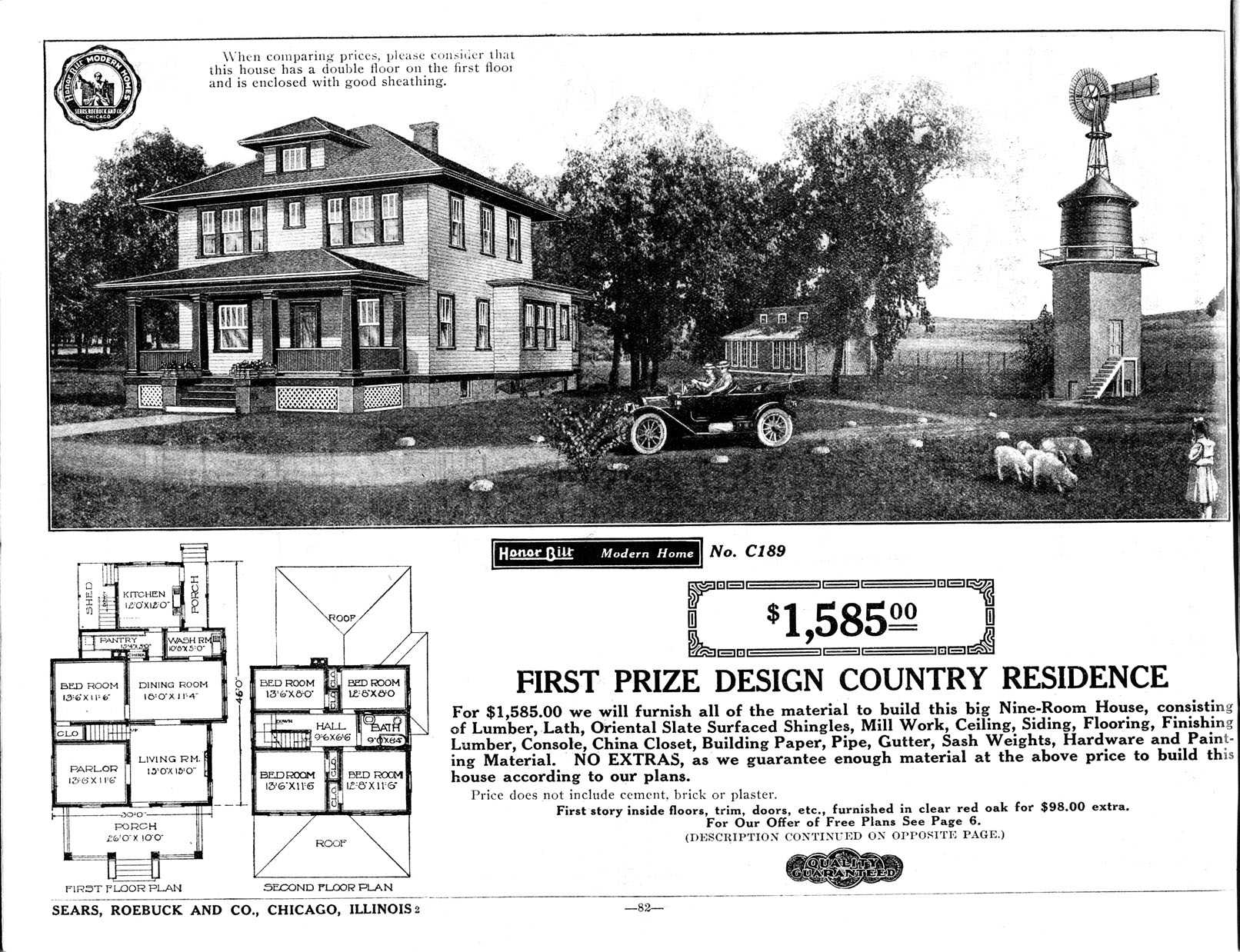
"The Hillrose" (Model No. C189) Sears Catalog Home appearing in the 1916 Sears Roebuck Catalog. Sears Roebuck Catalog / Wikimedia
I often tell interviewers who ask me to define the term “McMansion” that McMansions are like obscenity: you know it when you see it. Like beauty (and obscenity), McMansions seem to be in the eye of the beholder. The simplest way to define a McMansion is: a poorly designed, poorly executed, oversized house. But there’s something more to them than looming entryways, vinyl siding, and mismatched windows that causes the knee-jerk hatred they rouse in so many. In part, the wounds are historical: as the 2008 crash unfolded, McMansions became the symbols of aspirational hubris, of excess, of wanting too much and borrowing too much to get it.
Today, McMansions are no longer quite same symbols of economic hubris and loss. (If the McMansion were truly dead, home size would have never risen to new heights shortly after the recession). What they truly represent, what they’ve always represented, is how under late capitalism, modes of consumption and commodification reach ever-deeper into our daily lives.
Like reality TV and video art installations, McMansions are inherently postmodern. Postmodernism, to paraphrase the philosopher Frederic Jameson in an essay on the subject, involves the commodification of culture, art, and, ultimately, of one’s lifestyle. Postmodernism removes context from subjects, weakens or eliminates historicity, and effaces the divide between high culture and consumer culture, reducing culture to a series of images, the consumption of which becomes a new sort of commodity fetishism.
In a crucial part of Jameson’s essay, Postmodernism’s central effect on architecture is described as “pastiche.” It’s worth quoting in full:
the random cannibalization of all the styles of the past, the play of random stylistic allusion. … This omnipresence of pastiche is not incompatible with a certain humor, however, nor is it innocent of all passion: it is at the least compatible with addiction — with a whole historically original consumers’ appetite for a world transformed into sheer images of itself and for pseudo-events and “spectacles” (the term of the Situationists). It is for such objects that we may reserve Plato’s conception of the “simulacrum,” the identical copy for which no original has ever existed. Appropriately enough, the culture of the simulacrum comes to life in a society where exchange value has been generalized to the point at which the very memory of use value is effaced, a society of which Guy Debord has observed, in an extraordinary phrase, that in it “the image has become the final form of commodity reification”
Postmodern architecture’s invocation of the traditional via the pastiche takes a populist form: the idea that the kinds of architecture people explicitly consume — in places like Disney World, colonial Williamsburg, or Las Vegas — are somehow superior to the so-called “high-minded architecture” of modernism. Ultimately, this can be reduced to “let the market decide what is truly great.”
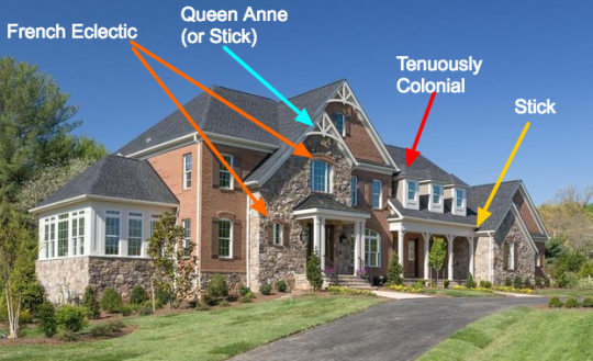
The separation of individual images from their historical contexts is what leads to the hackneyed, askew aesthetics of McMansions themselves, which can boast, say, three types of windows invoking three types of styles, assembled alongside a collage of details from seventeenth-century French Baroque, eighteenth-century Colonial, and nineteenth-century Victorian, all majestically rendered in architectural foam. The erasure of the professional architect from most residential architecture is an unforeseen result of this attack on “high culture” — after all, who better to design a house than a housewife with a window catalog?


Formally, the McMansion is the result of attempts to architecturally assimilate a disparate, ever-growing list of wealth signifiers, something I have called the “Checklist Aesthetic,” named after the key plot device in the HGTV hit show House Hunters. Every episode of House Hunters starts the same way, with a checklist of atomized “must-haves”: wood floors, five bedrooms, huge yard, tall entryway, and so on. Should a house fail to contain any of these various elements, it is ultimately rejected in favor of one that does.

To show the extent to which homes are designed on the basis of wealth-signifier accumulation, a historical comparison is in order. In 1915, if you were to look for a house that boasted five bedrooms, you’d find a rather no-nonsense plan designed to suit the needs of its likely middle-class inhabitants:

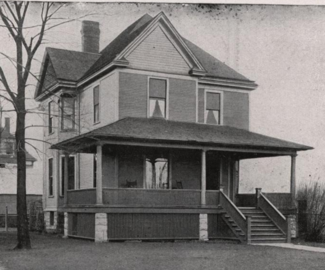
The exterior realization of this plan is straightforward and looks like this


If you were to look for a home based off the HGTV checklist criteria now, you would find one that looks like this:


Yes, both houses have five bedrooms, but one has almost three times as much square footage as the other. Why? Because it has to allot space for the numerous wealth signifiers that are now deemed necessary in the boom-and-bust era of house-building and house-selling. Here is a list of the “key features” of the second house that separate it from the first:


Each of these assets is a tick mark that adds to a home’s selling value. If you’ve ever seen an episode of HGTV’s Designed to Sell, you may have noticed how the magic number in the corner of the screen (selling value) goes up, up, up, each time one of these assets is added. It’s not just structural assets that increase selling value, but individual signifiers of wealth and power, like tall foyers, chandeliers, material finishes like stone and wood, certain wall colors, and the latest, trendiest furnishings. These signifiers originate in contexts that give them the character of wealth, but most have been stripped of those contexts — in the words of Lacan, their signifying chain has broken down.
Foyers, and their associated elements such as columns and tall ceilings, are borrowed from buildings like banks and courthouses, invoking a language of wealth, power, and prestige. Chandeliers are interesting because they’ve been divorced from the necessary labor that once made them so blatantly luxurious — every day, several workers had to perilously climb tall ladders with fire to light the chandelier’s myriad small candles. The same goes for material finishes like wood and stone, whose harvesting and finishing is much more laborious (and therefore indulgent, and even sublime) than their artificial counterparts. Neutral wall colors like white, grey and beige have always been favorites of elegant bourgeois interiors. In the words of Jean Baudrillard, “The world of [bright, loud] colors is opposed to the world of values, and the ‘chic’ invariably implies the elimination of appearances in favor of being: black, white, grey — whatever registers zero on the color scale — is correspondingly paradigmatic of dignity, repression, and moral standing.”
The greater the accumulation of these symbols of wealth, the “better” one’s home becomes, regardless of how much one’s family needs a “snack room” or eighty foot ceilings. The housing bubble transformed the material culture of homemaking, from the 1950s-era pattern of consuming commercial items in the home to the current era where the home itself is consumed. The 1915 home featured above was designed to be livable; the 2000s home, to be salable. And though the real estate market has settled in recent years, the power of home consumption maintains itself through America’s new favorite pastime: remodeling.
In previous eras, people remodeled when needed, replacing worn items, structures and appliances. The idea of total home transformation essentially emerged alongside mass production, which brought down costs. Even so, whole-home redecorating was mostly a pastime for wealthy families. The growth of specialized electronic media was key in fostering today’s remodeling culture. HGTV is one example, but internet sites like Pinterest, Houzz, and Dwell keep people transfixed with the consumption of home improvement and decoration as a permanent hobby and pastime, regardless of whether individuals plan to sell their home. Home decorating trends, which were seen in the twentieth century as changing on a decade-by-decade basis (a relatively rapid pace, thanks to mass media), have been changing in today’s era of hyper-consumption at an observable rate of every two to four years.
This rate of consumption is, of course wasteful and unsustainable, as is the McMansion itself — isolated from public life, requiring long commutes by car (with an interior plan that isolates members of the household from each other), large quantities of natural resources to build, and energy to heat and cool. Apart for the Hummer, there are few clearer examples of conspicuous consumption.
One interesting casualty of this era of hypercommodification is the loss of the concept of permanence in the relationship to the home. In the last forty years, no home has been truly permanent, between rigorous schedules of redecoration or renovation and the sheer speed at which people were buying, selling, and flipping homes at the height of the bubble. These spatial transformations at the hands of capital have left us permanently ill at ease with the appearance of our homes. Our homes will never be good enough: as soon as they become such, the whole cycle begins anew, and the endless wheels of consumption keep turning.
We need a cultural re-examination of what a home should do for us. Are we building our homes to cater to the communal needs of a family or to accommodate items or signifiers that will impress others? Will a home inspire its inhabitants to spend time with one another or isolate themselves in myriad rooms? Are we building a home to live in, or are we preoccupied with the idea of selling it even before the first brick is laid? Do we want to remodel or redecorate, or do we feel we have to because we’re constantly flooded with content that makes us feel inadequate if we don’t?
It’s time we as space-inhabiters break this unsustainable, unnecessary, and wasteful cultural cycle of consumption and reclaim our homes as our proverbial rocks, the spaces that make us feel safe and content. Who gave industry-funded media like HGTV or Houzz the right to dictate the proper and best ways to inhabit our spaces, to ridicule or diagnose as wrong those of us who lack the desire or the means to constantly consume in precisely way they want us to? A home isn’t an investment vehicle where cash goes in and more cash comes out, or the “After” segment of a television show. A home is, above all, an intimate, personal place; a haven where our intricate lives as human beings unfold. Grey paint be damned.